R. Kyle Bocinsky, Andrew Gilreath-Brown, Keith Kintigh, Ann Kinzig, Timothy A. Kohler, Allen Lee, Bertram Ludaescher, Timothy McPhillips
2023-09-29
Note: While we have extensively tested SKOPE, this is a complex software application that is only recently completed. Please notify us if you run into any problems or discover any bugs. We look forward to adding additional datasets and making software improvements as time and funding allow.
Introduction. SKOPE is a Web application that provides easy graphical and analytical access to paleoenvironmental data.
For the Four Corners region of the Southwestern United States (Arizona, Colorado, New Mexico, Utah, and portions of adjoining states), high spatial and temporal resolution precipitation and temperature data from PaleoCAR (Bocinsky 2015) are provided for the last 2000 years. For example, using SKOPE, one can obtain estimates of the water year (October-September), annual precipitation and growing-season growing-degree days (GDD) between 1 C.E. and 2000 C.E. for any 800m x 800m grid cell in the region.
In addition, the Palmer Modified Drought Index for the past 2000 years is available for the contiguous 48 US states, as is a static 90-m digital elevation map (SRTM90).
The spatial grid units in the SKOPE datasets are referred to as “cells”, each of which refers to a defined, rectangular (generally approximately square) area. For example, in the PaleoCAR dataset, pixels are 10 arc-seconds by 10 arc-seconds or about 800m x 800m. The pixel size defines the maximum spatial resolution of the dataset.
SKOPE Data are Modeled. It is important to recognize that the SKOPE datasets provide modeled, not measured, data values. Information about the models is provided in the dataset metadata and in publications referenced therein. To view the metadata click on the ![]() icon (the red triangle enclosing an “!”) displayed to the right of the dataset title. We use that symbol to warn users that in interpreting SKOPE data, they should be aware of important information contained in the metadata including a discussion of the uncertainty associated with the modeled data. In general, there are a number of interacting sources of uncertainty and it is not possible to provide a single quantitative measure of uncertainty (which in some cases can vary from year to year and spatial cell to spatial cell). In interpreting both the raw and summarized data provided by SKOPE, it is essential that uncertainty be taken into account.
icon (the red triangle enclosing an “!”) displayed to the right of the dataset title. We use that symbol to warn users that in interpreting SKOPE data, they should be aware of important information contained in the metadata including a discussion of the uncertainty associated with the modeled data. In general, there are a number of interacting sources of uncertainty and it is not possible to provide a single quantitative measure of uncertainty (which in some cases can vary from year to year and spatial cell to spatial cell). In interpreting both the raw and summarized data provided by SKOPE, it is essential that uncertainty be taken into account.
Contributing Datasets, Reporting Bugs. If you have a dataset you would like to contribute, discover any bugs, or have any suggestions, please contact us using the CONTACT link at the bottom of the web site footer. You can also email us directly at skope-team@googlegroups.com or visit our GitHub site to report an issue (https://github.com/openskope/skopeui/issues) or participate in discussions (https://github.com/openskope/skopeui/discussions) about the app.
Using the App
Start the app. Click on the Run the SKOPE Application link on the SKOPE Home Page or navigate directly to https://openskope.org/app. The app is easiest to use in a window 1270 or more pixels wide but can be run in narrower windows. In these wider windows, two panel pages (Visualize and Analyze Data) will have the panels displayed side by side rather than stacked vertically.

Navigating within the app. Navigation is accomplished through a dropdown menu accessed from the menu (hamburger) icon  to the left of the SKOPE title in the header.
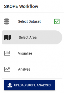
The grey-highlighted entry in the menu shows the currently selected page: Select Dataset, Select Area, Visualize Data, or Analyze Data. Pages other than Select Dataset display an orange navigation button, such as ![]() , that can be used instead of the menu navigation. On the Select Dataset page, clicking on an orange-underlined dataset title takes you immediately to the Select Area page. You can, at any point, return to choose a new study area or switch datasets. You can also use the browser’s “back” button to return to earlier steps.
, that can be used instead of the menu navigation. On the Select Dataset page, clicking on an orange-underlined dataset title takes you immediately to the Select Area page. You can, at any point, return to choose a new study area or switch datasets. You can also use the browser’s “back” button to return to earlier steps.
The LOAD SKOPE ANALYSIS button ![]() , near the right margin of the header or in the menu, allows you resume a previous analysis where you left off, assuming that you downloaded the analysis file from the Analyze Data Page before you exited SKOPE. Load Analysis restores the dataset, selected area, selected variable, and time range.
, near the right margin of the header or in the menu, allows you resume a previous analysis where you left off, assuming that you downloaded the analysis file from the Analyze Data Page before you exited SKOPE. Load Analysis restores the dataset, selected area, selected variable, and time range.
Select Dataset Page
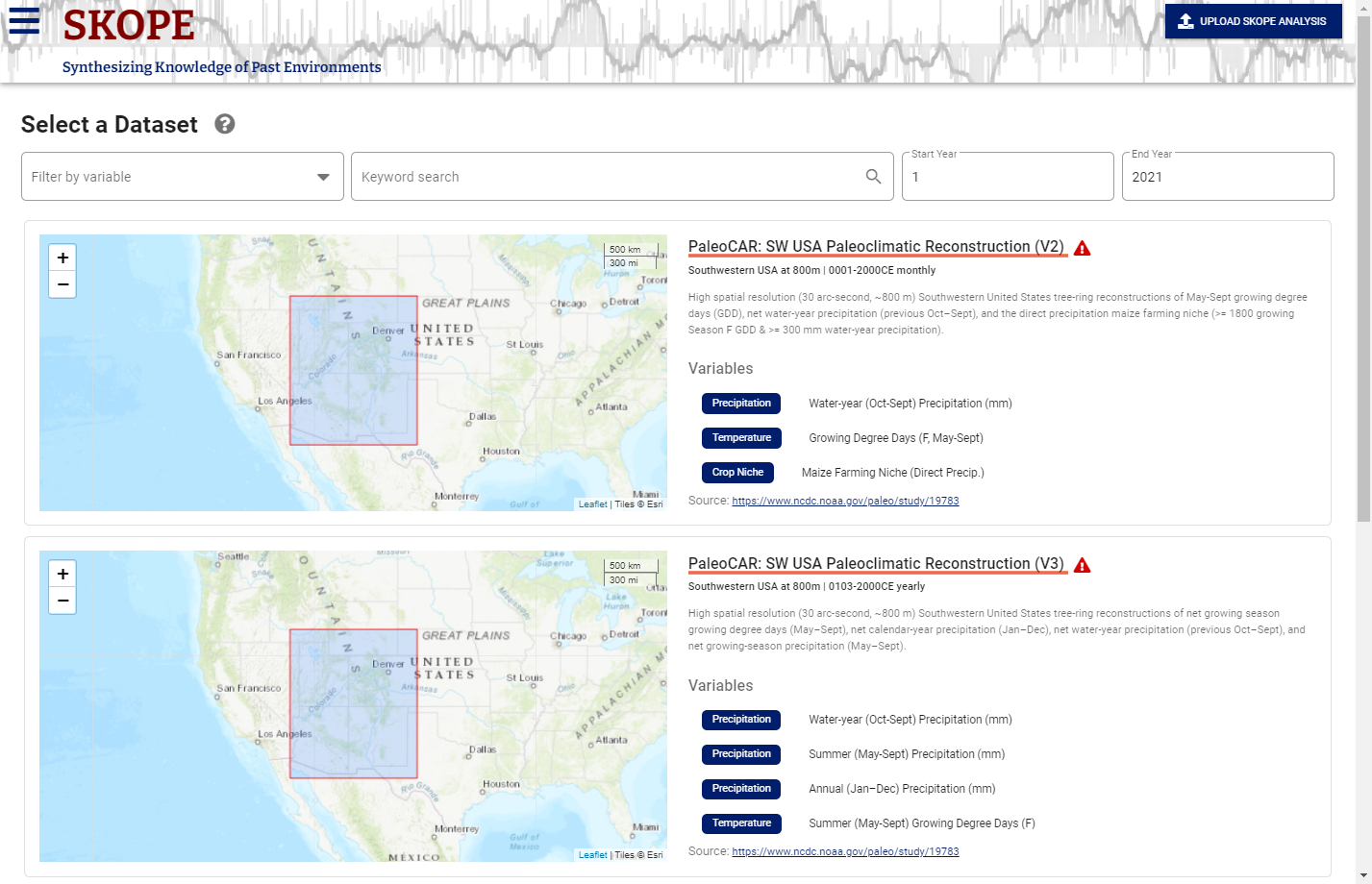
SKOPE opens to the Select Dataset page. Select a dataset by clicking on the orange-underlined dataset title in the right pane of the app window. You can scroll though the available datasets on the right side of the window. The displayed map for each dataset shows its spatial coverage and the description on the right provides some detail, including the temporal scope of the dataset, variables included, and spatial and temporal resolution
![]() View Metadata. Clicking on the
View Metadata. Clicking on the ![]() icon to the right of the dataset title opens a window that displays the dataset metadata. This icon is also available on other pages, displayed to the right of the dataset title, below the header.
icon to the right of the dataset title opens a window that displays the dataset metadata. This icon is also available on other pages, displayed to the right of the dataset title, below the header.
Filter Datasets. You can filter the view of available datasets by selecting a variable, entering a keyword, and/or a time range of interest in the filter options below the navigation bar.
Select Area Page
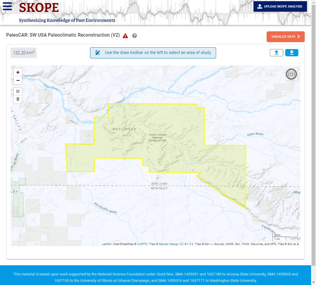
Once you have selected a dataset, you are automatically moved to the Select Area Page. This page is used to define the area over which the paleoclimatic data is displayed and statistics are calculated and graphed. You can draw the boundary of the study area or you can upload a GeoJSON file that describes one or more polygons (up arrow button on the screen). You can save an area you have drawn with the down arrow (download button). (See Save or Restore your Area Selection, below).
Study Area Size Limits. For high spatial resolution datasets (such as PaleoCAR), the application will be more responsive for smaller study areas. And, for those datasets, some areas may be too large for SKOPE to process interactively. SKOPE’s computation load mainly depends on the size of the smallest rectangle (oriented E-W/N-S) that will enclose the selected area. At present, for PaleoCAR, a maximum area of that rectangle before the app times out is about 10,000km2 (e.g. ,a square about 100km on a side or a 50km radius circle). For lower resolution datasets, such as the Living Blended Drought Atlas, there is no practical limit.
Grid cell sizes. PaleoCAR: 30 arc second rectangles (~800m x ~800m); Living Blended Drought Atlas (PMDI): ½ degree (~50km x ~50km); and SRTM 90m Digital Elevation Model: 0.3 arc seconds (~90m x ~90m).
Manipulating the Map. You can pan the map (drag it left and right and up and down at the same scale) by holding down the left mouse button and moving the mouse. You can zoom using the + and – controls on the upper left corner of the map or by using a mouse scroll wheel.
Outline your specific area of interest. Pan and zoom (+/-) the map as much as possible while still displaying your complete area of interest. You can change the base layer using the globe icon in the upper right of the screen, which may help in identifying landscape markers and outlining your area of interest. The shape icon on the upper left of the screen allows you to select a point, or draw a circle, rectangle, or arbitrary polygon. (These shape icons will not show if an area is already selected on the screen.) Once an area has been selected it can be edited (one vertex at a time) or discarded using the edit or trash can icons below the shape icons. Hint: If you want to change the size or location of a rectangle diameter or the center or diameter of a circular area, it will be easier to simply clear the selection (click on the trash can icon then click on “Clear All”) and redraw it than edit it a vertex at a time. If you draw the study area boundaries, you can analyze (and save) only a single polygon at a time. If you wish to include multiple polygons in your analysis, you will need to include them in a GeoJSON upload.
![]() Save or Restore your Area Selection. At any time, you can save your area selection (useful especially for painstakingly drawn polygons). This saves the selected area to your computer so that it can be reused in this or a later session. Download the selected area using the download icon in the upper right; upload the selected area in future sessions by using the upload button. You can also compose your own area selection in GeoJSON format using long-lat coordinates. Download a trial selection to see the format.)
Save or Restore your Area Selection. At any time, you can save your area selection (useful especially for painstakingly drawn polygons). This saves the selected area to your computer so that it can be reused in this or a later session. Download the selected area using the download icon in the upper right; upload the selected area in future sessions by using the upload button. You can also compose your own area selection in GeoJSON format using long-lat coordinates. Download a trial selection to see the format.)
Visualize Data Page
The Visualize Data page has two main panels: an animated map on the left and a graph on the right. The graph shows the selected variable’s values, averaged across the selected area, for the selected time range. Using colored shading, the map shows the spatial variation in the selected variable for a given year (indicated below the graph and by the vertical orange line on the graph). You can change years by clicking anywhere within the graph. Note that the selected area can also be modified using the controls on the map.
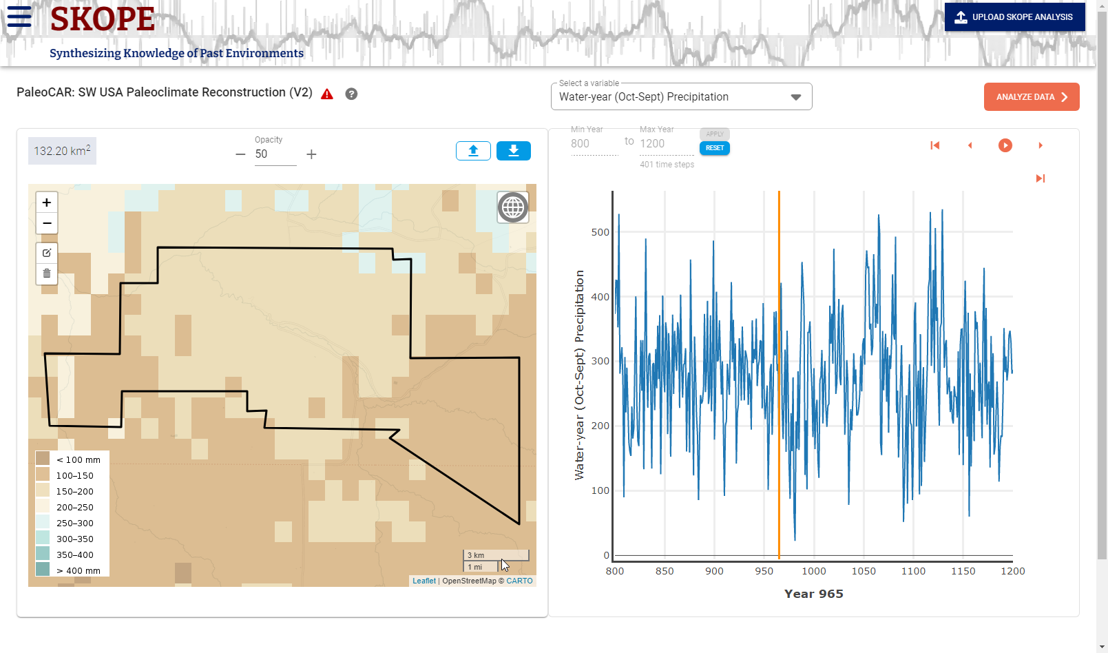
Select a Variable. Just below the header, SKOPE displays the dataset title and, in a dropdown menu, the variable being graphed and analyzed. If the dataset offers more than one variable, you should can select the variable of interest using the dropdown menu.
Identify the Time Period of Interest. By default, the map animation is set to start with the first year available for the dataset and the graph displays the full time-range available in the dataset. Many users will want to look at a more restricted time range. Immediately above the left side of the graph, you can change the beginning (Min Year) and ending year (Max Year) of interest. Be sure to click on the Apply button or press Enter to register your change. SKOPE displays the number of time steps that are modeled between these two values (inclusive). The time step is the minimal temporal interval that is modeled. For example, in PaleoCAR, the time step is one year. Note that at present SKOPE only accepts positive (CE/AD years) not negative (BCE/BC) dates.
Run the Map Animation. ![]() Using the Animation control bar (located above and to the right of the graph), the colored overlay of the value of the selected variable shows the spatial distribution of values for the entire mapped area, time step by time step. The legend is shown on the lower left of the map. As the map animation runs (once you press the play button), the year is displayed below the graph and a vertical orange line on the graph shows the current year. Clicking a location on the graph changes the current year. You may run, pause, step forward or back a year, or go to the beginning or end of the interval using the animation control. If you wish, you can interactively drag or zoom the map display. It may be preferable to use a non-colored base map, such as Stamen Toner-Lite, for careful analysis of these maps; otherwise the base map colors may conflate the variable overlay coloring. You can change the base map using the globe icon in the upper right of the map.
Using the Animation control bar (located above and to the right of the graph), the colored overlay of the value of the selected variable shows the spatial distribution of values for the entire mapped area, time step by time step. The legend is shown on the lower left of the map. As the map animation runs (once you press the play button), the year is displayed below the graph and a vertical orange line on the graph shows the current year. Clicking a location on the graph changes the current year. You may run, pause, step forward or back a year, or go to the beginning or end of the interval using the animation control. If you wish, you can interactively drag or zoom the map display. It may be preferable to use a non-colored base map, such as Stamen Toner-Lite, for careful analysis of these maps; otherwise the base map colors may conflate the variable overlay coloring. You can change the base map using the globe icon in the upper right of the map.
Adjust the Opacity of the Variable Value Overlay. The opacity of the colored overlay of variable values is adjusted with the Opacity control above the middle of the map. By default, some or all features of the base map are visible through the variable value display. With an opacity of 100, the base map is thoroughly obscured; at 0 only the base map shows. The default is a compromise and you may achieve a better visualization with a different opacity (and with a non-colored base map).
Examine Graphed Data for the Area of Interest. To the right of the map, a graph displays the value of the selected variable averaged over the cells of the selected area, for the stated temporal interval. The graphed value is the mean value of the selected variable calculated over all grid cells enclosed within or intersected by the area boundary for the current year. For points, the graphed value is the value for the grid cell in which the point resides.
If you move the cursor into the graph, you will see the year and climate data value pop up for particular year corresponding to your cursor position.
Analyze Data Page
On the Analyze Data page, you can tailor the data display to most effectively address your particular research questions.
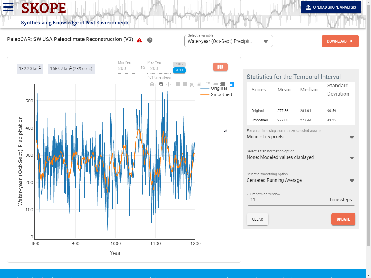
Select a Variable. Just below the header, SKOPE displays the dataset title and, in a dropdown menu, the variable being graphed and analyzed. If the dataset offers more than one variable, you will first want to select the variable of interest using the dropdown menu. (If you have selected a variable or time period in a previous step, it should be carried over here.)
Identify the Time Period of Interest. Unless you modified the temporal range on the Visualize Data page, the graph displays the full time-range available in the dataset. You will usually want to look at a more restricted time range. Immediately above the left side of the graph, you can change the beginning (Min Year) and ending year (Max Year) of interest. Be sure to click on the Apply button to register your change. SKOPE displays the number of time steps that are modeled between these two values (inclusive). The time step is the minimal temporal interval that is modeled.
Spatial Grid/Cells. SKOPE’s raw data are modeled values for a specific time step and spatial grid cell. Above the graph on the left, SKOPE displays the area in km2 of the selected study area as outlined on the maps. Next to that, it reports the number of cells and the area covered by the cells that are included within or intersected by the selected area outline. While you can precisely specify a study area on the SKOPE map or via an uploaded study area outline, SKOPE computations are based on computations over all grid cells that are contained within or are intersected by the area or point you have selected. This means that the area considered in the computations is generally larger than your actual selection.
Graph Panel. By default, what is plotted for each time step is the mean, over the selected cells, of the modeled values of the selected variable. For example, in PaleoCAR, each point on the default graph might represent the mean across the study area pixels of modeled mm of water- year precipitation for a given year.
Customizing the Graphical Display. You can customize the graphical display in several ways. First, the graph will be recalculated whenever you redefine the study area, change the temporal interval, or change the variable being analyzed. Second, you can change the display by modifying parameters listed in the Statistics for the Temporal Interval displayed to the right of the graph (see below) once you click on the orange Update button. Finally, you can use the Plotly functions (icons that appear when you put the cursor in the upper right of the graph), to zoom in or out on the graph. Use the reset axes button (tiny home icon) to restore the graph. Note: Zooming in on the graph using the Plotly tools does not change the interval over which the statistics are calculated.
Temporal Interval Statistics. At the top of the Statistics panel, in the line starting with “Original,” SKOPE displays the mean, median, and standard deviation of the summarized values for the selected area over all time steps. In these calculations, at each time step the value used for the selected area is the summary value (mean by default) of all selected pixels. If the values are Z-score transformed as described below, the mean median, and standard deviation of that fixed interval are displayed in the line beginning with “Transformed”. If the values are smoothed, the mean median, and standard deviation of the smoothed or transformed and smoothed) data are displayed in the line beginning with “Smoothed”.
For Each Time Step Summarize Selected Area As. You can change how the values for the selected area at each time step are summarized from the default, mean, to the median. If the median is selected, the graph and Temporal Interval Mean, Median, and Standard Deviation will change to reflect that at each time step the median is used as the modeled value for the selected area at each time. While the mean is commonly used, the median provides a robust summary that is less sensitive to extreme values within the selected area at each time step. The selected value is termed the “summary value” in the discussion that follows.
Transformation. The data may be Z-score transformed in three ways. In a Z-score transformation, each value is subtracted from the mean value over a relevant time range and divided by the standard deviation of the values over that same time range.
- None: Modeled Values Displayed. The modeled values are graphed without any transformation.
- Z-score wrt [with respect to] Selected Interval. Instead of the summary values, the graph displays Z-score transformed values relative to the selected temporal interval. The Z-score value for a given year is the summary value for that year minus the mean summary value over all time steps in the selected interval with the result divided by the standard deviation of the summary values over all time steps in the selected interval. The Z-score for a year is the number of standard deviations above (+) or below (-) the longer term mean for that interval.
- Z-score wrt Fixed Interval. Instead of the summary values, the graph displays Z-score transformed values relative to a fixed interval entered by the user. The Z-score value for a given year is the summary value for that year minus the mean summary value over all time steps in the specified fixed interval with the result divided by the standard deviation of the summary values over all time steps in the fixed interval. The Z-score for a year is the number of standard deviations above (+) or below (-) the fixed (often longer term) interval mean. One might, for example, set the interval to be the span of the preceding time period. Thus, in PaleoCAR if the selected interval were AD900-1100, the fixed interval for the Z-score calculation might be AD700 to 900. In this case a Z-score value of -2.3 for precipitation for the year 1021 for would indicate that for the selected study area the modeled precipitation value for that year is substantially below (2.3 standard deviations below) the average computed for the AD 700 to 900 (previous time period) interval.
- Z-score wrt Moving Interval. Instead of the summary values, the graph displays Z-score transformed values relative to a moving window of a size selected by the user. If the window size is n time steps, the value graphed for a given year is the Z-score (number of standard deviations above or below the mean, with both the mean and the standard deviation calculated over the calculated over the given year and the preceding n-1 years). Thus, in PaleoCAR a Z-score value of +1.6 for precipitation for a given year using a 40 year moving window would indicate that for the selected study area the modeled precipitation value for that year is notably higher (1.6 standard deviations above) than the average computed over the preceding two generations. The moving window is likely more relevant to on-the-ground perceptions of environmental conditions than either the modeled value themselves or Z-scores over a large range of past and/or future values.
Smoothing. The graphed data can be smoothed in two ways. If the smoothing window extends before or after the period for which the dataset has modeled data, the smoothed value is Missing.
- None. No smoothing the summary values for a given year are graphed.
- Centered running average. If the window width entered is n, the graphed value for a given year is the mean of the summary values for the selected area, over n years centered on that year [(n-1)/2 years prior, the current year, and (n-1)/2 years into the future]. (n must be an odd number).
- Trailing average. If the window width entered is n the graphed value for a year is the mean of the summary values for the selected area over n years values for the current year and the n-1 preceding years.
Note that the Areal Summary, Smoothing, and Transformation settings operate independently and can be combined as desired. Thus, one could plot a trailing running average of robust (median based) values displayed as Z-scores relative to a moving temporal window.
Save the graph and the graphed data to your computer. The Download button ![]() will download to your browser, in a ZIP file: the graph (plot) in svg and png formats, the raw and transformed data values (timeseries) behind the graph in tabular (json and csv) format, a readme file, a file with summary statistics (summary.Statistics.json), and a file that saves all parameters used to generate the graph (request.json). Note that If the Areal Summary is the mean, then the raw data will be (default) mean values by time step, otherwise they will be median values by time step.
will download to your browser, in a ZIP file: the graph (plot) in svg and png formats, the raw and transformed data values (timeseries) behind the graph in tabular (json and csv) format, a readme file, a file with summary statistics (summary.Statistics.json), and a file that saves all parameters used to generate the graph (request.json). Note that If the Areal Summary is the mean, then the raw data will be (default) mean values by time step, otherwise they will be median values by time step.
Restore an Analysis State of the SKOPE Application. If you have downloaded the graph metadata in a previous session with the app (see description immediately above), you can restore the SKOPE app to that state. To do this, extract the request.json file from the downloaded ZIP file (for example, drag it to your desktop). Then, on any page in the SKOPE app click on the upload SKOPE Analysis button ![]() (on the right of the header or from the menu) and load the request.json file from your computer. You cannot load the request.json file directly from the zip file.
(on the right of the header or from the menu) and load the request.json file from your computer. You cannot load the request.json file directly from the zip file.
PaleoCAR – Methods
For each pixel, for each year, the PaleoCAR model selects the tree ring chronologies (from the National Tree Ring Database) that best predict the historic sequence of PRISM data for that location and uses linear regression to estimate the paleoenvironmental variable for that date and location (Bocinsky and Kohler 2014; Bocinsky et al. 2016). Tree ring chronologies were selected from the publicly available International Tree Ring Data Bank (ITRDB; Grissino-Mayer 2015; and Fritts 1997) and were geographically limited to include only chronologies within a 10-degree buffer of the Four Corners states, including Arizona, New Mexico, Utah, and Colorado. ITRDB data were downloaded and processed using the FedData package in R (Bocinsky 2016).
Historical climate signals were selected from PRISM’s spatially interpolated monthly 800m x 800m grid cells (which take into account elevation and several aspects of topography; PRISM Climate Group 2004; Daly et al. 2008). The historical calibration data set was limited to A.D. 1924–1983 (Bocinsky and Kohler 2014).PaleoCAR utilizes the CAR (Correlation-Adjusted corRelation) variable ranking and selection method to identify grid-cell specific combinations of tree ring chronologies that best estimate PRISM’s historical (1924–1983) values for that cell. PaleoCAR uses the long-term tree ring chronologies to create reconstructions of precipitation and growing-degree days that extend back to 1 C.E. (see Bocinsky and Kohler 2014 for complete methodology; Bocinsky et al. 2016). The result is an ~800m (30 arc-second) resolution data grid of a 2,000 year (1–2000 C.E.) spatiotemporal paleoclimate reconstruction for each climate signal.
Caveat: Uncertainty/Error. The retrodictions provided by this tool are, of course, estimates subject to error. There is some error in the spatial interpolation done by PRISM. There is also retrodiction model error that is dependent both on the location and the year, with earlier years generally having larger errors than more recent ones (when more tree ring chronologies can be referenced). In this version, we do not provide specific error estimates but see Bocinsky et al. (2016) for a discussion of the error.
Caveat: Need for Spatial Smoothing. Each grid cell independently selects the best-fitting set of tree-ring chronologies to use in the retrodiction in a given year. However, because the selections are done independently, adjacent cells can pick different chronologies. A single difference in the chronologies selected can have a substantial impact on the retrodicted values, especially if the cell is in an area that has a weaker association between chronologies and the historic PRISM climate signal. This is more of problem with temperature than with precipitation, especially in lower-elevation areas. Thus, one should be cautious about relying on between-cell differences within a small area. If a study area larger than one cell is selected, the graphed data provide spatial smoothing by taking the mean (or median) of the value across the selected cells.
PaleoCAR V2 vs PaleoCAR V3. PaleoCAR V2 provides Water year Precipitation, Summer Growing Degreed Days, and Maize farming Niche variables. PaleoCAR V3 provides, in addition, Summer and Annual Precipitation variables but does not provide the Maize Farming Niche variable. There are two substantial differences in method between PaleoCAR v2 and v3:
- In PaleoCAR V3 we use the detrended and indexed (standardized) series (‘ARSTND’) available from the ITRDB instead of the ‘Standard’ chronologies used in the V2 reconstructions. This led to four or fewer chronologies available for the reconstruction for the periods of 1–102 CE and 418–589 CE and hence missing data for those periods.
- In V3 we select models by minimizing the corrected Akaike information criterion in a stepwise fashion, instead of the predicted residual error sum of squares (PRESS) statistic in V2.
References Cited
Bocinsky, R. Kyle, and Timothy A. Kohler
2014 A 2,000-year reconstruction of the rain-fed maize agricultural niche in the US Southwest. Nature Communications 5:5618. DOI: 10.1038/ncomms6618
Bocinsky, R. Kyle, Johnathan Rush, Keith W. Kintigh, and Timothy A. Kohler.
2016 Exploration and exploitation in the macrohistory of the prehispanic Pueblo Southwest. Science Advances 2(4): e1501532 (01 Apr 2016) DOI: 10.1126/sciadv.1501532
Daly, Christopher, Michael Halbleib, Joseph I. Smith, Wayne P. Gibson, Matthew K. Doggett, George H. Taylor, Jan Curtis and Phillip P. Pasteris
2008 Physiographically sensitive mapping of climatological temperature and precipitation across the conterminous United States. International Journal of Climatology. DOI: 10.1002/joc.1688
Grissino-Mayer, H.D.
2015 The International Tree Ring Data Bank. Accessed and available at http://web.utk.edu/~grissino/itrdb.htm .
Grissino-Mayer, Henri D. and Harold C. Fritts
1997 The International Tree-Ring Data Bank: An enhanced global database serving the global scientific community, The Holocene 7(2): 235–238. DOI: 10.1177/095968369700700212